Yesterday saw the largest single day stock market drop since the great recession. While most would place the blame on the rapid spread of coronavirus, this was also a reaction to an oil price war where Russia and Saudi Arabia came to loggerheads, unable to maintain a three-year-old deal to coordinate their production levels. It began as an effort to respond to the lack of demand for oil due to coronavirus concerns but ended as an oil price war.
Market valuation calculations factor in the price of oil as a proxy for economic activity, and with the price of oil down almost 40% in 2020, market valuations looked much too high, and sold off. Add to that the already relatively high valuations as markets continued their climb earlier this year, and down came prices. We would probably have seen the markets correct even without the surprise shock from the virus outbreak.
Now to address the title of this missive. The reason I say we’re in uncharted territory is that no one really knows what the combined effect of both supply side disruptions and lack of demand as people’s daily lives – and spending – are affected by the need to keep distance between themselves and others will have on the global economy.
So, what to do? For us here at Navion, we’ll fall back on our processes as we have so many times before. Our normal approach is to not try and anticipate the markets, but rather let the markets be our guide. Prior to the continuing sell-off, we were already in a moderately defensive position due to what we believed was the relative equity over-valuation and overbought condition of the markets. Remember, we strive to buy into fear and sell into greed. This method doesn’t allow for picking absolute tops and bottoms but rather to avoid the worst of the damage while capturing our fair share of gains. And while there is now plenty of fear, our process is telling us the time to buy is “not just yet”.
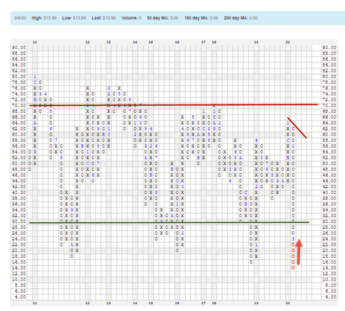
Looking at the chart below you can see the long column of Os, which represents supply, had reached oversold territory. But until it starts showing us that demand is beginning to move back into the picture, we will remain in our defensive posture, and perhaps even strengthen it a bit. See endnote for further explanation.[i]
Source: NASDAQ Dorsey Wright
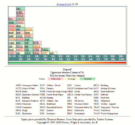
Before we see the demand show up in the overall market, we expect to see it in individual industry sectors. For this we use the Industry Bellcurve chart, below. Once again, refer to this endnote for more explanation.[i]
Notice how all the containers are piles far to the left, and all have lower-case font. This is a purely oversold market, and there is no sign of demand. That will occur first when the containers’ label font turn to uppercase and give us some confirmation when the containers begin moving to the right, indicating that stocks within those industry group are beginning to form uptrends.
Source: NASDAQ Dorsey Wright
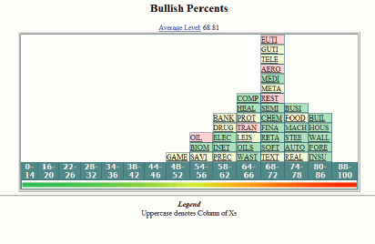
Because this has been the biggest sell-off since the Great Recession, I thought I’d dig back into past missives to show you what this looked like then. While history may not always repeat, it often rhymes, so this can be useful to give us perspective on today’s challenges.
The chart I’m showing you below is a comparison of March 2009 and August 2009, so that you might see the progression that occurs once market participants begin moving back into equities. Prior to March 2009 the charts looked very much like they do today – nothing but fear.
Here’s March 2009:
Source: NASDAQ Dorsey Wright
Notice that while all the containers are still piled to the left, many are beginning to display their labels in uppercase font.
And now, here’s August of 2009:
Source: NASDAQ Dorsey Wright
Every single industry sector is now at or above 50% of its members in uptrends. The process is to wait until demand begins to move back into the picture. Most market participants are still very wary of the markets, hence buying into fear. You just don’t want to buy at the first signs of fear. You can have rallies within bear markets, but until those trends start to form to may be trying to catch a falling knife. Not the best idea.
Well this missive is already long. Rather than make it longer, I think I’ll stop for now. If you’re already a Navion client, know that we are working hard to minimize damage to your portfolios. If you’d like to know exactly what that means for you, contact us at your convenience. If you’re not a client but would like to learn what we think of your portfolio, schedule a phone appointment via our website, one of our emails, or heck, just give us a call. We’ll continue to monitor the situation, make changes as necessary, and keep you posted.
Joel
[i] For those of you long time clients and other readers, you’ll recognize the point and figure chart . Rather than recording prices over a fixed period, point and figure is a measure of supply and demand irrespective of time. Shifts occur when they occur. Xs denote upward movement, or demand, and Os denote downward movement, or an excess of supply. The letters and numbers embedded within the columns indicate the month of the year that the movement was recorded. As you will note, the years (across the bottom) are not all of the same size. That is because we only record actual changes, and some years there are more changes than others. The numbers one through nine signified January through September, and A, B and C are October through December. This particular chart does not measure price but rather the percentage of stocks on the New York Stock Exchange (really big companies) that are in uptrends versus downtrends.
[ii] This chart shows the 40 or so major industry sectors that comprise the economies of major industrial nations, including ours. Each “container” represents a sector. The position of the container represents the number of companies within the sector whose stock prices are trending up versus trending down. For example, if the container is in the 64 to 66 column, it means that 64 to 66 percent of the companies in that sector are in uptrends. If the sector symbol is in uppercase letters, it means that the sector is gaining strength. Lowercase means the sector is losing strength. Once a the sectors begin piling up to the right of the chart, you would say the market is becoming overbought, which is a higher risk condition. Piled to the left would be oversold, meaning that much of the risk has been rung out. Ideally, you’d like to buy a stock in a sector that has moved far to the left, and then shows uppercase font, meaning it is starting to move up from a lower position of risk. Overall, you would prefer to put money to work in a market where many or most sectors display these characteristics.


